Fair enough to say that I am entirely obsessed. I’ve decided to pick up watercolors as both a hobby and a potential side gig (the side gig part assumes that I will be able to stick with this and that it won’t sour, even if it eventually becomes something I do for money…and that’s saying a lot….so I’m hedging my bets here…) Nonetheless, I have decided to learn how to use watercolors and the learning process is so stimulating!
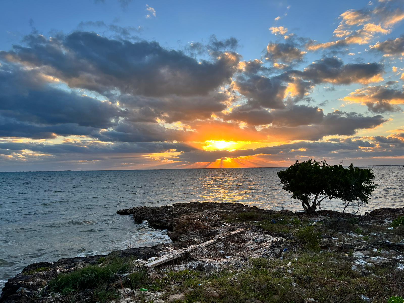
If you google enough, you will quickly discover that watercolor pros recommend that novices paint the same subject multiple times in order to track progression. So I painted this reference photograph five times over, and I’ll sum up the things I learned each time below.
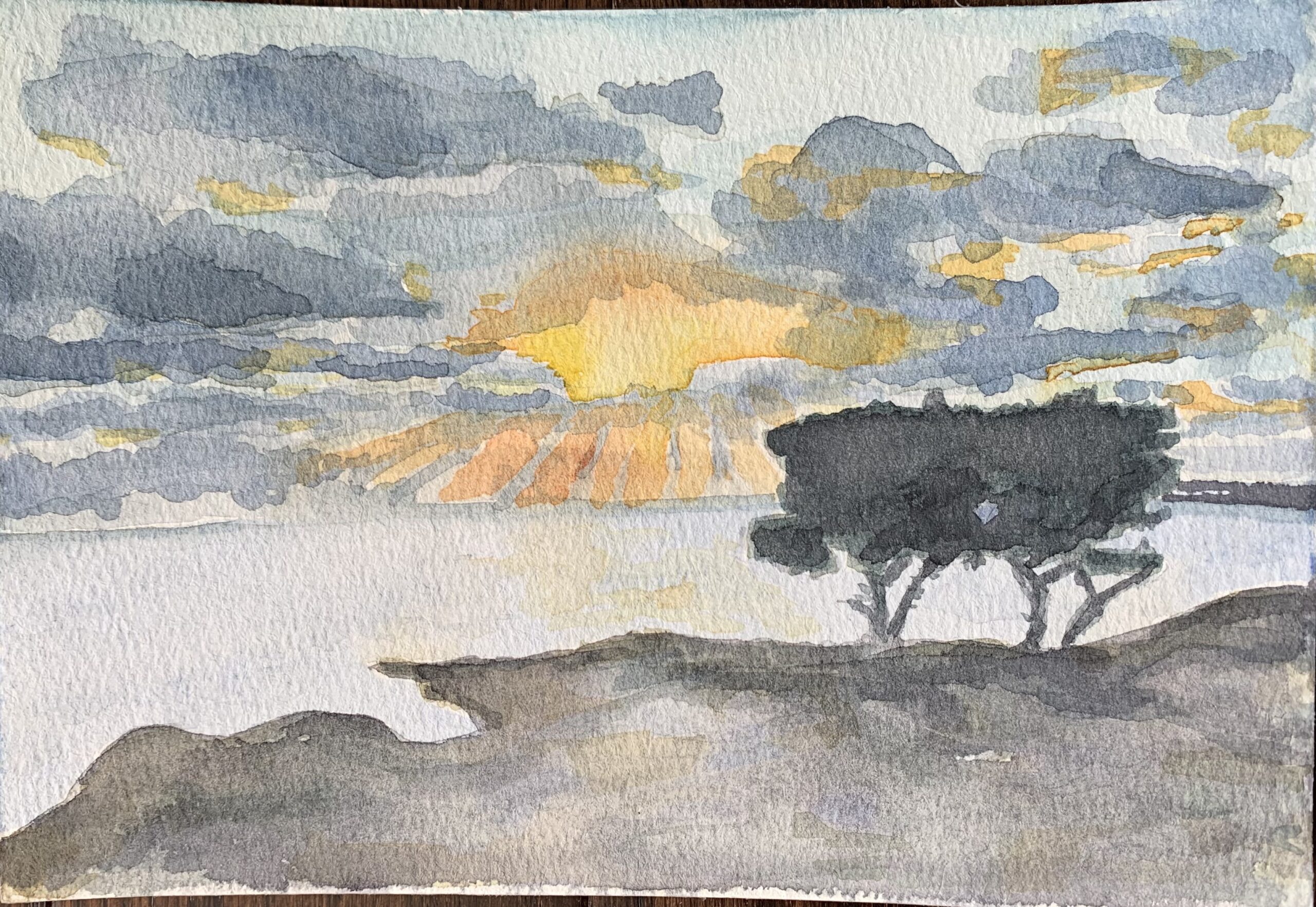
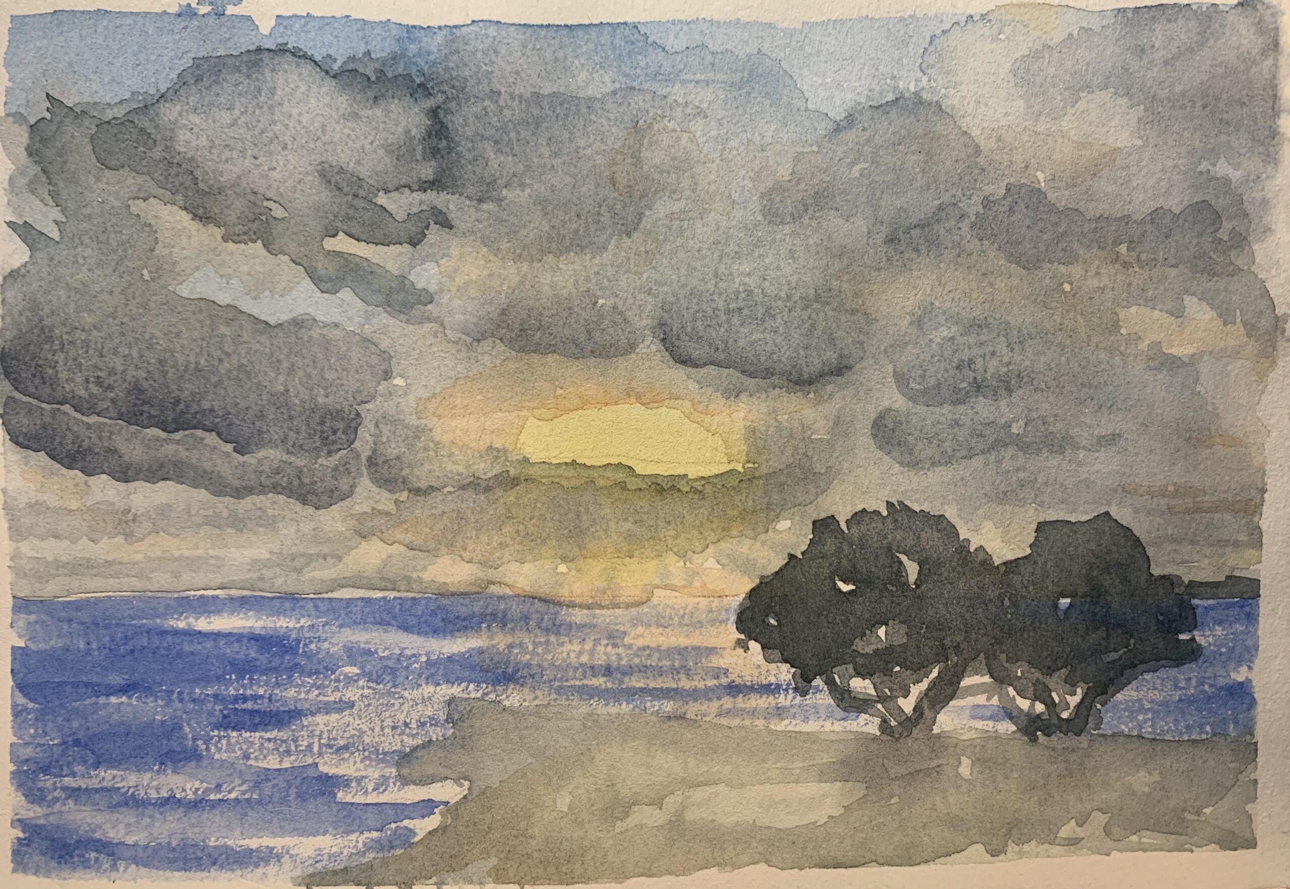
While I’m decently happy with the color mixes in the sky, the orange light peeking through the clouds has harsh, brittle edges. The composition is also confusing – is the viewer to focus on the ground or on the sky? The texture of the ground is nice, but competes with the sky. The horizon line is horribly crooked. No wonder they advise that you use a ruler when painting ocean horizons.
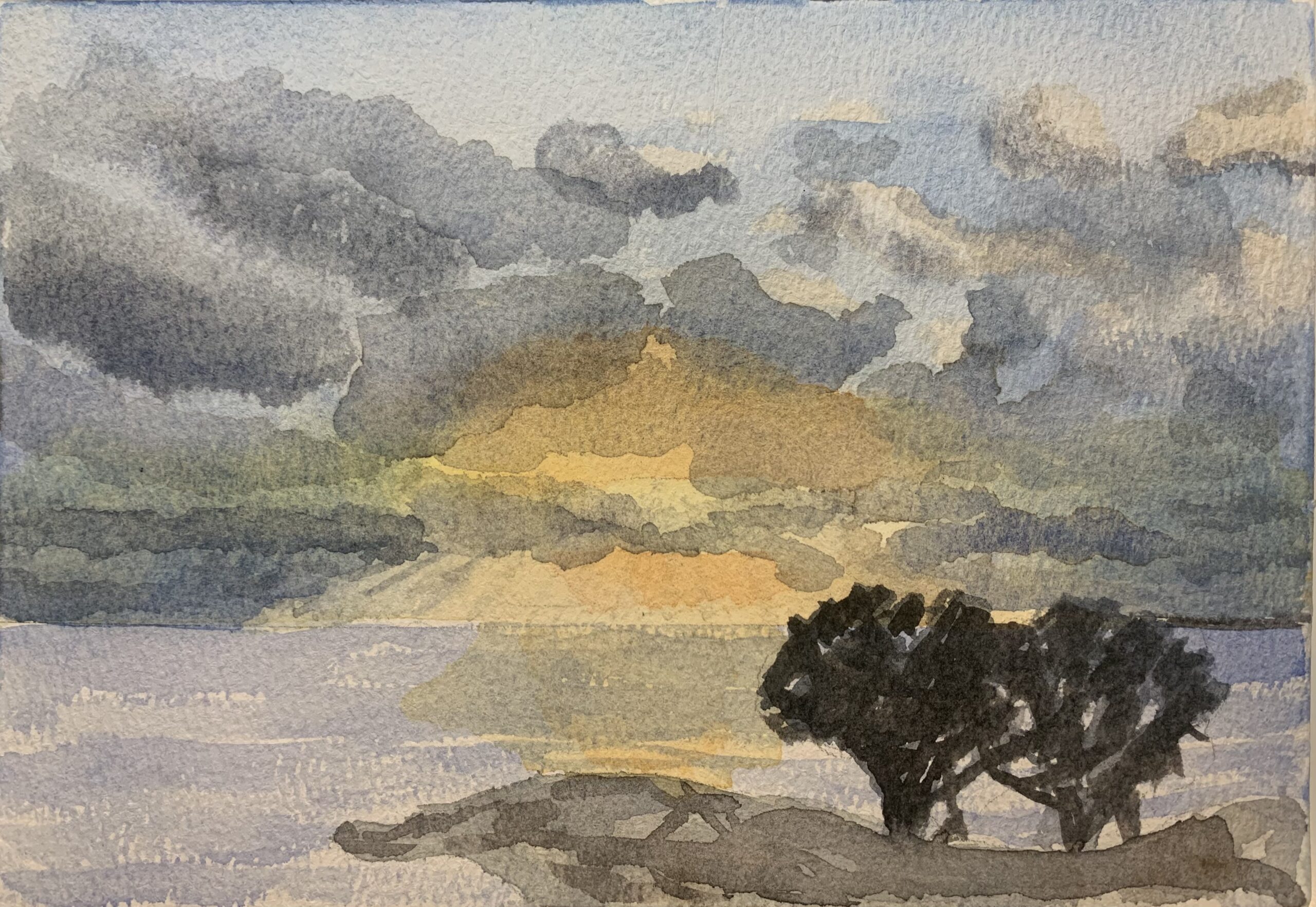
The triumph here was figuring out how to give the orange light in the sky softer edges. But the clouds veer way too blue this time, and the sky lacks perspective. The fingers of god are crooked, and my attempt at giving texture to the water is childish at best. Composition is still unsatisfying and I realized that trying to paint the plank on the ground is a lost cause. Better just to eliminate it altogether. The trees are cute, though!
Dry brushing the ocean was a good idea here, to give the ocean texture/the idea of foam or movement. As was the improved composition, where emphasis is given to the sky. I like the simplicity of this one. The ocean color is very fake; the sky colors are pleasing, but I did a messy job of separating at the horizon line and there’s a big blob right where the orange light bleeds into the ocean in the middle of the painting. I got so carried away with cloud formation that I ended up painting over the blue in the top middle, which would have been really important for perspective. So now, it just looks like one mass of grey cloud—almost as if there were a storm impending. The tops of the grey clouds have improved and softened from last time, and the clouds do look like they have more volume. For an impressionistic piece, this one is actually really pretty and is my second favorite.
Finally nailed the sense of perspective in the sky!! The trick was to leave white highlights so that I could shape the clouds and give them dimension. I followed the formula of painting from light to dark and soft to hard, but as I was trying to “paint the color of the light”, I overestimated the amount of yellow light in the sky. I tried to correct the yellow by overlaying blue, which just turned the bottom third of the sky a very ugly and unrealistic green. No such thing as green light. Such a major fail. But hooray! Finally corrected the perspective in the sky! I also improved the ocean color. Lastly, I think there’s too much of an orange flare so will correct that one next time.
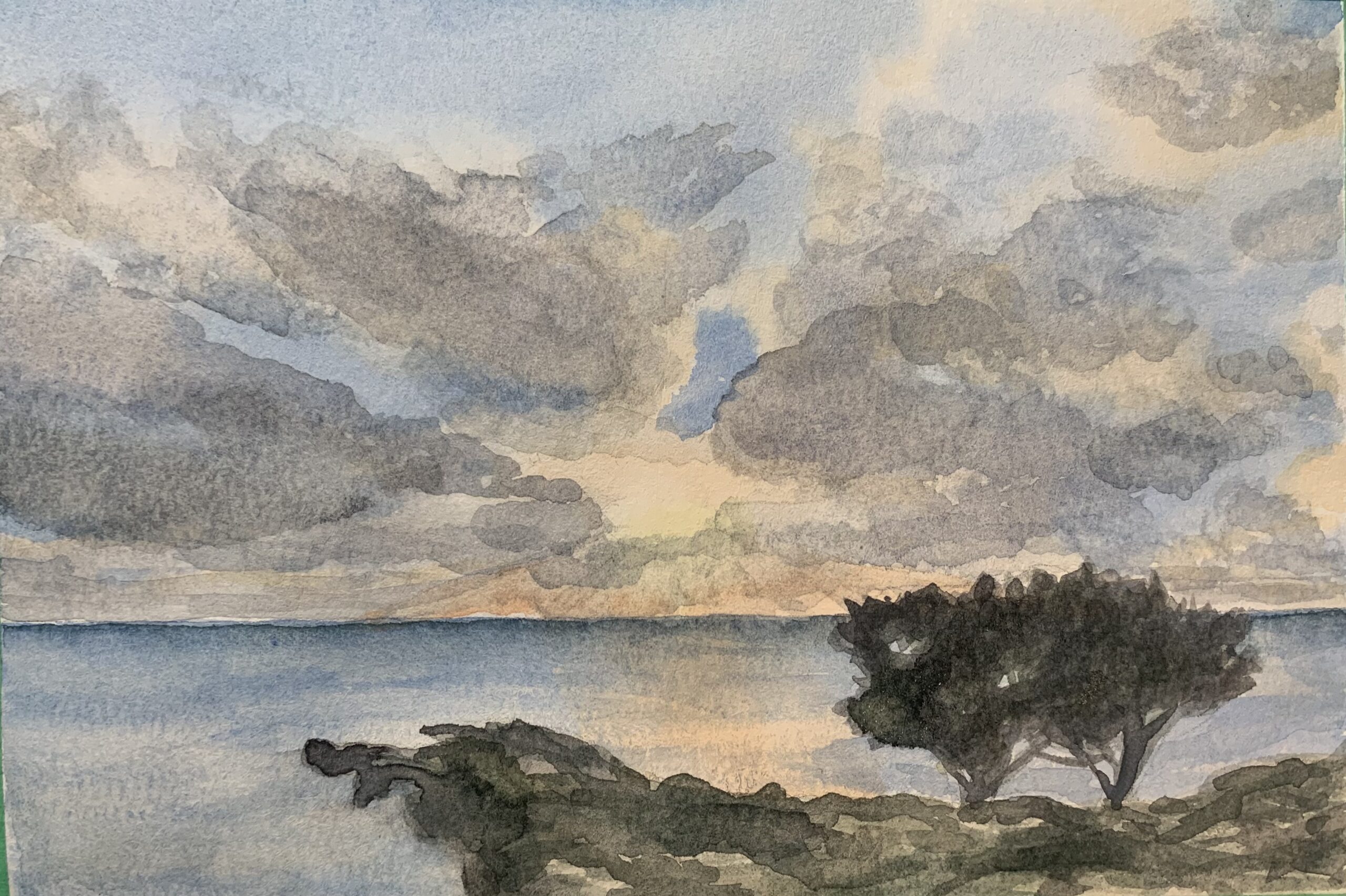
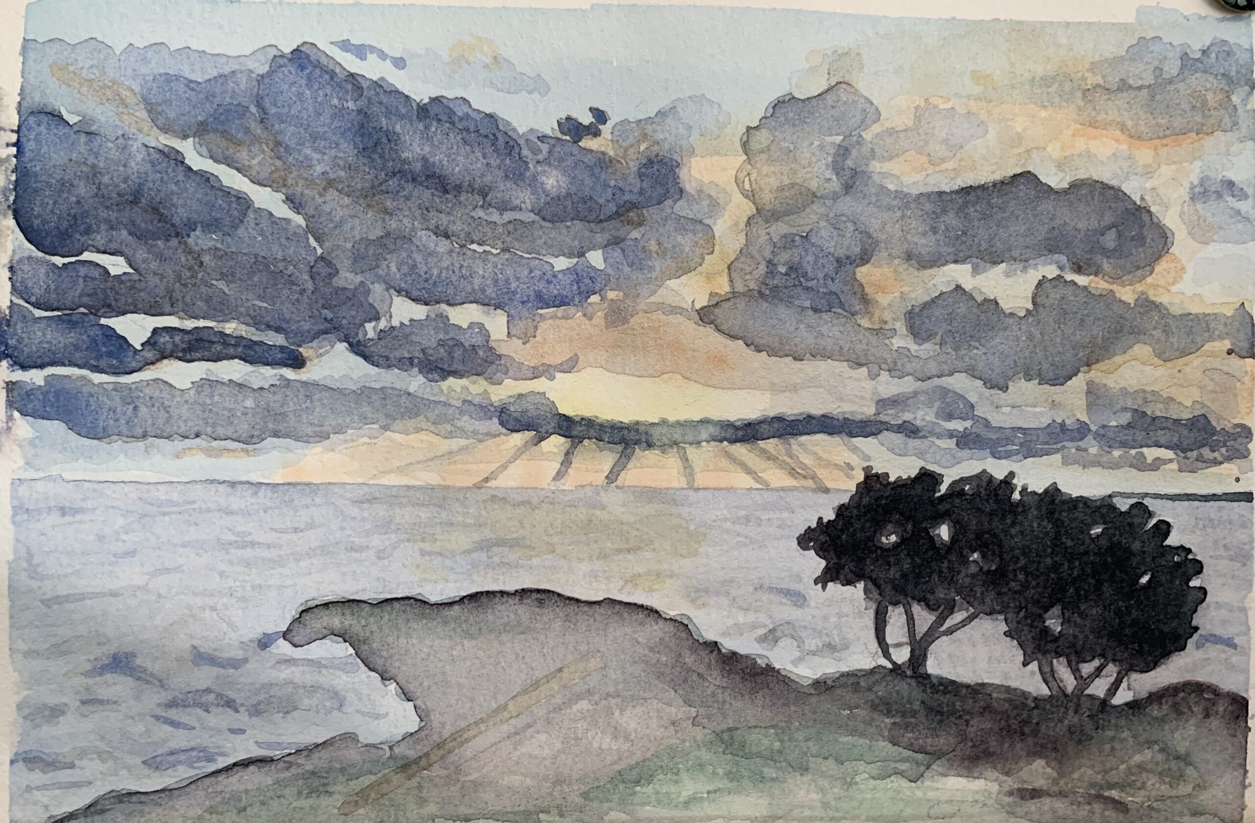
Corrected all the above errors, giving the clouds a good sense of dimension and volume, and I discovered one more new thing. The color of the ocean in the reference photo is more of a steely turquoise – there are hints of green to the ocean, a moodiness because of sunset. Thus, adding a turquoise layer to the horizon line, then bringing it down in a graded layer gave the ocean depth. I made errors with smudging and blending in some areas, but those are minor. I appreciate the texture of the land in this version. Though by no means a professional piece, I would not be shy to display this version.